Small Iterations Leading to Big Changes
Cross-Functional Collaboration
Product Manager
Design Manager
VP of Product
VP of Design
Business Management
Marketing Team
Role
Lead Designer
User Experience
Visual Design
Prototyping
Timeline
Problem
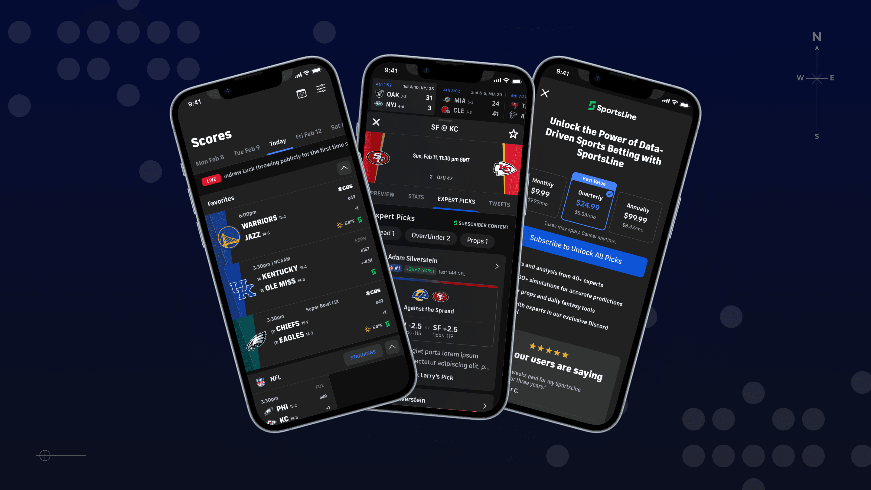
The original expert picks experience was built with savvy bettors in mind—heavy on stats, light on context. Casual bettors were underserved: they lacked clarity around expert performance, didn’t know what they’d get with a subscription, and were often routed out of the app to take action.
Approach
We focused on near-term small improvements that would meaningfully improve trust, comprehension, and conversion while minimizing the level of effort by reusing as many existing components, APIs, and data points as possible. It was a game of Tetris.
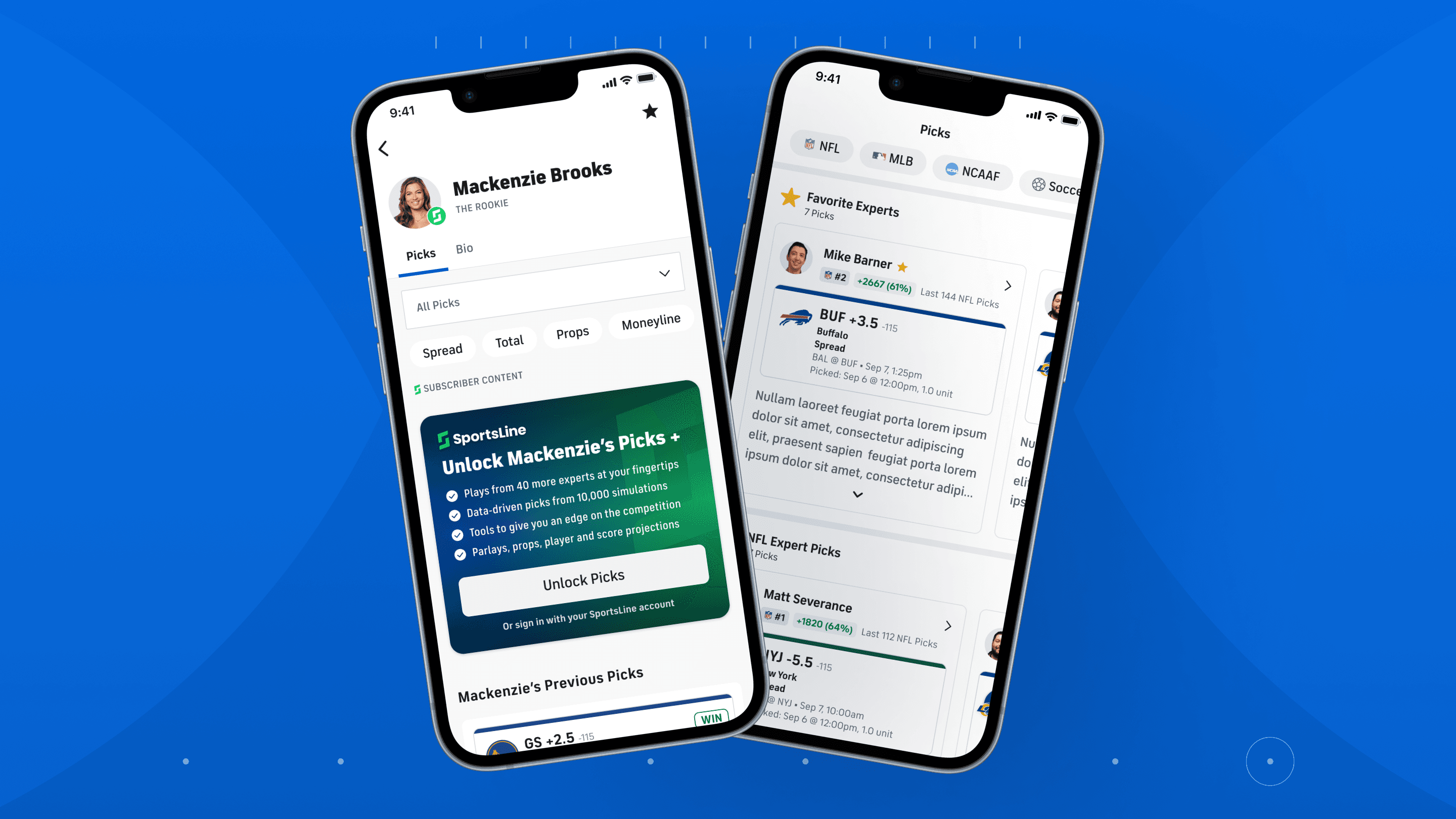
Refined streak visuals to clearly convey performance data and build transparency.
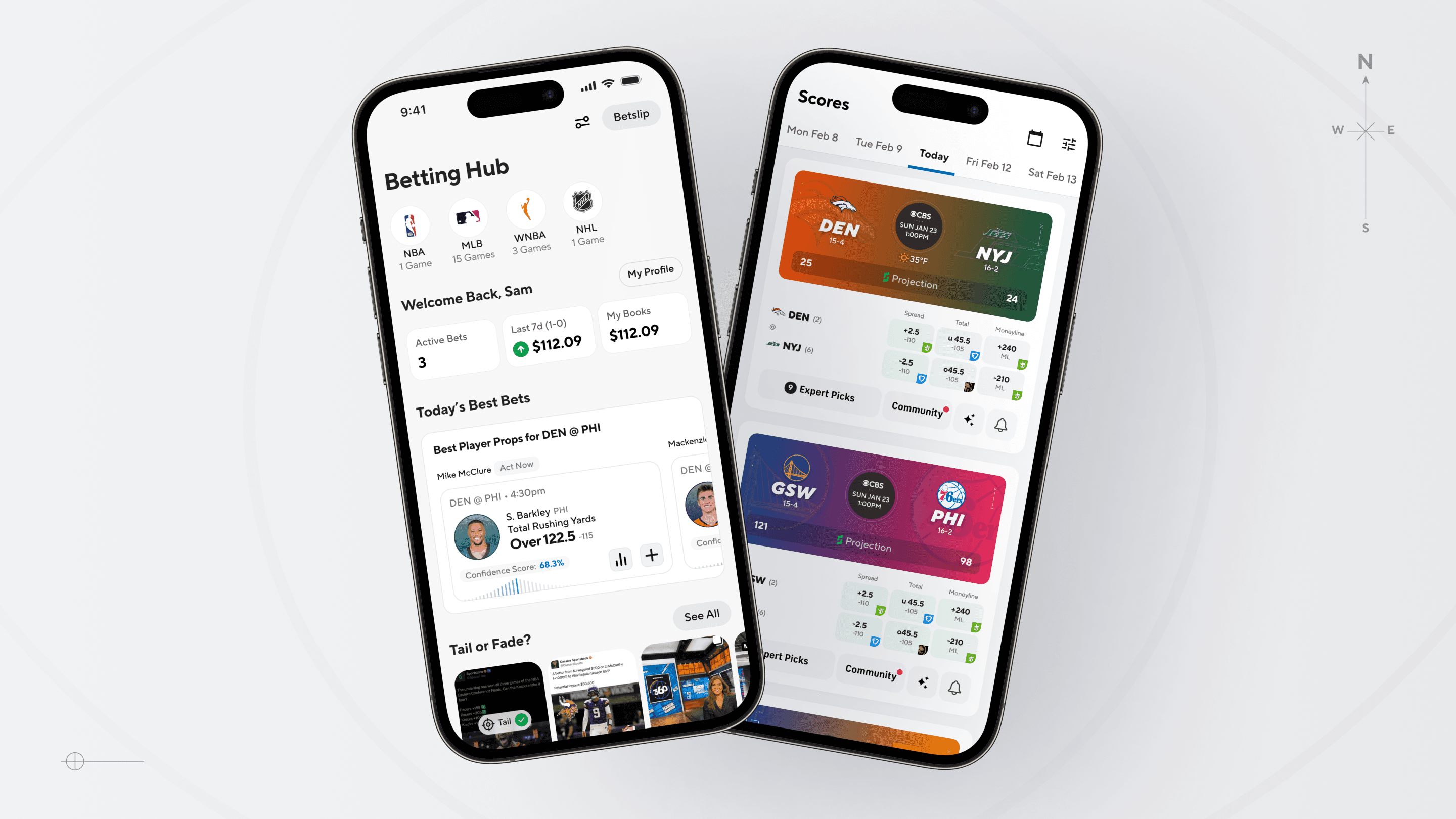
Reworked the UI to show both sides of the line, highlight key data (e.g. odds and player and team info), and increase scannability for casual users.
Designed a variety of promo cards showcasing what a subscription entails, top experts for a given league, and expert specific promo cards to increase awareness and drive subscriptions.
Designed a few variations of the subscription page ranging from short form to detailed and robust product information depending on the entry point and user. The goal was to clearly convey the value proposition and increase transparency into what users get with a subscription.
Added visual cues to signal games with active expert picks, making picks discoverable without having to click into every single matchup.
Impact
The revamped picks, scoreboard, and product page experience delivered measurable improvements in user engagement and conversion behavior.
Clicks are now driven by what matters most: a dramatic increase in clicks now come directly from enhanced expert pick cards compared to the original experience which came from . This shift signals that users are finding the picks more compelling, scannable, and actionable.
Strategic additions—like Hottest Expert Promos, value-prop cards, and clear CTAs—broadened the surface area for entry, creating a more frictionless path into the subscription funnel.
Together, these outcomes validated our approach—balancing design craft, behavioral insights, and practical constraints to build a more habit-forming, conversion-optimized experience.